Exploring the Mysteries of Substack #4: Pictures and Style
Call this the Decorating Page
Hi again, Newbies. It won’t be long before I’ll have to stop calling you that! We’ve worked our way through tutorials #1, #2, and #3, and we’re getting to the point where this is all I know. So we’re almost done here.
Don’t worry, though. I won’t leave you in the lurch. There are other places you can go for more information, and now that you know the basics maybe they’ll make more sense. I’ll post links at the end. And you can always come back here.
We’ll start with pictures. I’m a big fan of pictures on blogs. They’re enhancements that don’t compete with words, they fit anywhere, and they make your space look good.
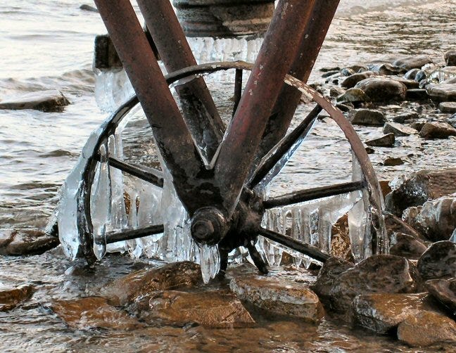
There are many ways to find them and to add them. I often choose the easy way, as I did above, and just grab one of my own and paste it in here. (Right click on picture, press ‘Copy’ or Ctrl-C, right click again when you get to where you want it, press ‘Paste’, and there you are.) If it has a name in your files and you want to add it that way, click on the ‘picture’ in the tool bar above, click ‘Add image’, find the file name, and click ‘Open’. It’ll magically appear right where you’ve placed your cursor.
You can change the size of any picture by grabbing the diagonal arrows at bottom right to make your pic larger or smaller.
Unsplash is Substack’s default source for free photos. You access it by clicking on the photo icon, then clicking on ‘Search’, but you can find free images at many sites. No matter where you find them, if they’re not your own, make sure you add a source in the caption. Photographers need recognition as much as writers do. You wouldn’t want your work to be used without permission or attribution, and neither would they.
I’ve used Unsplash, Pixabay, Canva, and others, but I’m careful to make sure I’m allowed to use them, and I always look for attribution. If I use Google Images, another great source, and I can’t find the photographer’s name, I link the picture to the page where I found it. (You can limit your Google search by asking for free images of whatever you’re looking for, but again, be careful. They’re not always free. It’s best to double check.)
Beware of licensed pictures. For example, Getty Images is famous for cracking down on innocents who might have used one of the gazillions of their pictures, fining them big bucks for copyright infringement. They charge fees to license most of their photos, so attribution often isn’t enough. I’ll be honest—their website makes no sense to me. Personally, I wouldn’t touch them with a ten-foot pole.
The bottom line on pictures: Always caption them, and always give credit where credit is due.
STYLE: This is where you get to make your pages your own—up to a point.
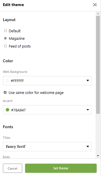
THEME: This is how I set mine.
I use ‘Magazine’ theme and I love it, but some writers say it’s too busy. Others like a straight list of their posts and it works for them.
I use Fancy Serif font because I’m old school that way, having grown up reading serif almost exclusively, but I’m not opposed to sans serif.
You have some choices with theme color, as well. I just switched from red to green because the red was starting to get on my nerves.
Just play with these themes until you find one that suits you. It won’t take long.
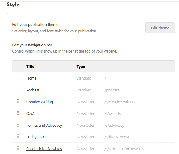
Navigation Bar: My navigation bar looks the way it does because I’ve added Sections to my page. You don’t have to break your posts into sections unless you see the need. So don’t worry if you don’t have them.
If you don’t, your navigation bar will be far less cluttered. You’ll have HOME, ARCHIVE, and ABOUT.
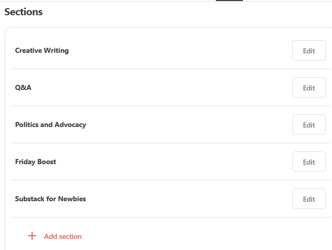
Sections are useful if you’re writing about several separate and distinct topics. (See mine as an example) This is what mine looks like behind the scenes:
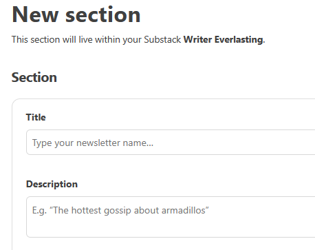
When you click on “Add Section” you’ll go here:
There are a few other prompts on that page but for now this is what you’ll need. Give your Section a title. The short description will appear at the top of that section so that when readers click on it they’ll know what they’re going to find there. It doesn’t have to be long.
If you’ve already posted pieces that will fit in the new section, you can add them to any section by going back into that post’s Edit page and clicking on the tab at top left, which you’ll seeis now a Sections tab. (It’s not there if you have no sections.)
HOME always gets you back to your home page.
ARCHIVE shows a list of all of your published works so far. It’s automatic. You don’t have to do anything. And check out the little magnifier. If you click on it, it turns into a search bar. (I didn’t know that until fairly recently. Now I use it all the time.)
ABOUT: Right now your About page is someone else’s boilerplate. Get to work on this as soon as possible. If you’re stumped about what to include, read the About pages of other writers. We all go at it in our own unique way and some of them are really great reading. Be creative. This is your chance to introduce yourself.
You can take a look at mine here. When you do yours, you’ll be giving it your own personality. You’re telling your readers about your newsletter, but they also want to know about you. They’re deciding whether to hang around for a while and they need to know about the company they’re keeping.
Don’t think of it as a resume or a proposal, think of it as a welcome letter to your readers. If you’ll be sharing your skills on your pages, yes, do mention those skills, but you’re trying to draw in long term readers. It’s your style of writing they’re going to be looking for.
So that’s it then. These are the bare-bones basics to get you started. I hope I’ve made it clear enough, but if I haven’t, you know what to do.
Just ask.
You’re making this experience your very own and I can’t wait to see where it takes you. Now promise you’ll have some fun out there.
The Substack Help Center can answer most of your questions, but if you need more help, you can also reach the support staff at support@substack.com. They’re sometimes very busy but when they do get back to you, you’ll know they mean it when they say they want to help.
Substack now has NOTES, a Twitter-like in-house application solely for Substack readers and writers. (That’s you now.) You’ll meet other writers there, and it’s a great place to introduce yourself. If you still have technical questions, all you have to do is ask. If you want answers from a Substack staff member you can signal them in Notes with @Substack.
If you know of someone else who could use this brief tutorial, please pass it on. This Section link includes all tutorial posts.
The doors are always open here at Writer Everlasting. Subscriptions are free, there’s never a paywall and nothing is closed to you. You’ll find the coolest people hanging out in the comment section. We’re writers talking about writing. Right up your alley!
Welcome aboard!


Thanks for the information regarding theme. I tried both magazine and fancy serif for the first time and adopted both of them.
You've done such great work with this! My preference for photos not on Upsplash is Canva, but I paid for an account.